Saturday 8 September 2007

Diana Paez


I discovered this illustrative motion graphics designer by chance on youtube, the site is worth checking out, the short videos and self promotion collage style collections are contemporary and nothing too unusual but I found myself thinking that they may be achieveable by myself and fellow students whereas usually im daunted. The content varies from things like brown paper bag backgrounds, to 'godzilla' size woman striding through sky scrapers, animated little cubes jumping down stairs, shapes and blocked colours falling from the sky, words flying around etc etc, all very positive 'day dream' material, simple visual ideas to perhaps base your own beginners level videos on if you're not too competent like me yet!

Check out her site www.dianapaez.com

Friday 7 September 2007

Junk Food ad ban


I've been considering the vast scale of the food industry and the opportunities for research and personal study. The continuing national debate regarding child obesity, and the pressure upon fast food chains to take responsibility in informing customers of nutritional information in printed formats etc. I wasn't aware of the decision made by OfCom, as documented in Nov 2006, to ban tv advertising of convenience foods deemed unhealthily high in fat, sugar and salt during
- pre-school childrens programmes
- entertainment channels popular with under-16's
- all cable and sattelite children's channels
- pre-watershed adult shows that are popular with school children.
This apparently came into effect after January of this year, with Burger King voluntarily withdrawing adverts and deciding to stop creating them.
You can read a full archive of articles and debates...
http://news.bbc.co.uk/1/hi/business/6157708.stm

paperchase design @ Borders


I seem to spend increasing amounts of money in 'Borders' these days, the selection of stationery and greetings cards are often sources of inspiration and visual indulgence for me. The designs of paperchase lately are based around vivid colour, floral patterns, fantastical arrays of nature and swirls, very nice to draw ideas for illustrations from.

Wednesday 5 September 2007

PROVOKATEUR


I found the link to this agency's site on hannah smithies blog and took a look as i was drawn to the sketchbook style aesthetics. It's another funky layout of books and interactive sections to explore. Most interestingly, the 'think tank' section provides several scrapbooked articles taken from archive newspapers spanning controversial issues in the world of branding. 'Charity Chic' for example, documents charity's in their quest to brand themselves, but with the danger of becoming seemingly too polished, products, instead of a service.

It's worth a look, the full articles can be read and there is definitely dissertation possibilities!

Edward Monkton illustration


I discovered a link to his website on Rebecca Pericleous's blog and was very glad. His greetings cards never fail to make me smile, the pure random humour he associates with the grand scheme of life as a journey in such raw hand drawn formats is one of a kind. I often purchase his cards for others, but mostly for myself to pin up and enjoy. There are several desktop wallpapers to download and a screensaver also if you appreciate his work as i do.

www.edwardmonkton.com

ambient media.. continued


Yet another strong example of clever street ambient media from Leo burnett. This time for bird seed, how better to communicate its yummyness, than by installing a giant box of the stuff on a street, lining the top with real bird food, and waiting for the flocks to arrive!

Leo Burnett Macdonalds ambient ads


ambient media is by far my favourite method of advertising to study, I am forever amused by new genius examples, these ads for macdonalds, created by Leo burnett were no exception. Arctic shakes, advertising upon a huge orange snow plough vehicle parked on an american beach, extra thick milkshakes shown upside down formating a street lamp post, and the huge red shoes of ronald macdonald emblazoned upon a city bus! Very quirky, youthful and upbeat, its no wonder the campaigns are successful globally in more than a dozen marketing formats, these have led to a global resurgence in sales, especially amongst teens and their mothers apparently.

Leo Burnett website navigation


I'm aware of Leo Burnett's amazing website being previously mentioned on other student's blogs, and I found it great to play with. The large black pencil operating as the cursor, along with the scrawled pencil lines it leaves wherever you drag was very novel, but the way the sections of the site and the subheadings etc all swing around with sound effects and thumbnails is very visually stimulating. The way its put together makes it all seem so easy to create an interface such as this, if only that were the case!

Tuesday 4 September 2007

sex or the monkey?


I thought it would be interesting to look for other chocolate advertising, the 'indulgent' sector of products has given me food for thought and may well lead to a vast area of research. I thought this advert for magnum ice cream (although in french) uses sex to sell, in the form of Eva Longoria. The luxury and desirability of the product is there for all to see, but personally i think the choice of Eva Longoria, who has I doubt has ever eaten an entire chocolate ice cream, is a tad inappropriate. The hairy monkey for dairy milk wins hands down!

Cadbury's zoo fun


I've seen the cadbury's vids already posted on students blogs and its also proved worthy of the CR blog, several youtube viewers seem to feel strongly negative about the humorous gorilla playing the drums idea but i personally defy anybody not to have a giggle! the soundtracks and facial expressions cannot be taken seriously and I am indeed feeling the urge to go and purchase a large bar of dairy milk grinning all the way to the cashier as i remember the large hairy beast swooning to phil collins and bashing out the chorus with a genius array of facial expression. Enough said.

Made you stop and stare


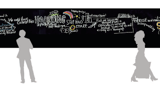
The colloquial language hand scrawled across these Nike basketball trainers made me smile as I had adopted the same approach to the D&AD land securities 80m hoarding brief, "made you look made you notice' is the type of 'i'm talking to you, yes; you' attitude I tried to convey, catching people's eye with handwritten dialect of a casual manner across a product or place. I think it's successful due to the quirky unfinished look, these trainers arent clean and white, they're covered in unsteady black ink, unstraight and squeezed into an ill-shaped space, its 'street wise' and edgy which is the type of consumer Nike attempts to appeal to.

Monday 3 September 2007

Cancel Cancer - Cigerette Ad


An ad taken from a useful advertising archive site adparade.com. It communicates 'smoking is a primary cause for lung cancer, some things you cant undo. Stop smoking'. (Agency - Y&R Beirut 2006)
A very simple use of universally recognisable computer 'loading'/'downloading progress' status bar with the 3 blocks of colour outlining the shape of a cigerette. The two buttons 'cancer' and 'cancel' are all that are needed. Not a very visually sophisticated layout or choice of background colour with faint smoke - slightly cliched, but all in all an effective idea that would be understood by all.

Colourful cabs


Another image from my stay in Bangkok this summer that I thought I would share. Throughout the City the taxi's were all multi-coloured and when gathering in traffic in colourful collation it was an interesting sight

Friday 31 August 2007

Paul Davis Website


This is the guy who did the humourous illustrations for the book 'Us&Them' that I previously posted. His new website also happens to be featured in the latest CR mag. It's worth visiting, if only to play with the interactive spider diagram that makes up the main menu, the individual hand-sketched arms are almost 'friendly' its quite a creepy experience! You can view his illustration collections, the sex diagrams are not for the faint hearted! Quite amusingly there is a section 'lunch with Davis application form', whereby you can complete your name, contact details, your budget, choice of restaurant and an explanation as to why you are worthy of his time. The guy's funny.

The New York Times magazine


The September issue of Creative review has an interesting article on the colour magazine that accompanies the New York Times newspaper, the American version of the Sunday Times magazine. "The newspaper still remains archaic and old fashioned design but the magazine is far more contemporary and graphically vibrant".. The photography within the publication is said to be award winning and at the forefront of US editorial art direction. The editors pride themselves on not working to a rigid layout of type boxes and image scale. The cover designs shown here simple state "T", the title of the magazine, derived from the black letter of the daily paper's titlepiece. It became the mag's logo and each issue the letter is represented in a visually stimulating new form; chocolate cake, black lace and colourful intricate swirls. It is a luxury magazine, embracing visual culture "T's art direction is a mix of appropriateness, wit, sheer beauty and clever page planning".
I thought it was a nice concept to draw upon the age-old "T" from a family of typefaces that have been used for decades upon the newspaper cover, and reviving it regularly to represent the contemporary awareness the publication has regardless of its age.